- About
Getting to know us
- Services
- Managed Services
- Application Services
- Cloud Services
- Data Science
- Consulting Services
- Technology Solutions
Managed Services
Application Services
Data Science
Consulting Services
Technology Solutions
- Industries
- Resources
Resources
- Contact
- Contact us
Customising chart colours in APEX 5.1
Contents
One of the new features of APEX 5.1 is the introduction of Jet Charts which are highly customisable using JavaScript and CSS.
One particular issue I recently came across was the removal of two chart region attributes that allowed easy customisation of a chart, namely COLOR SCHEME and CUSTOM COLORS. Prior to APEX 5.1 when creating a chart, you had several pre-set colour schemes to choose from along with the option to define your own set of custom colour as shown here.
So how do you override the default colour scheme now these attributes have been removed?
The following example is a simple pie chart using the default colour scheme to show the percentage of employees in each department from the EMP and DEPT tables.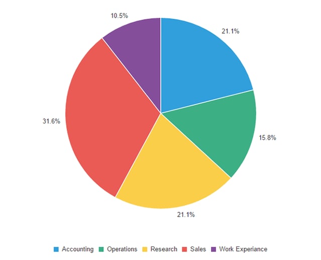
To customise the colours, we need to add some custom JavaScript to the new JAVASCRIPT CODE attribute within the chart region. This attribute allows us to use the JET Charts ojChart API to alter the configuration of the chart. APEX passes the JET Chart configuration object to this function when rendering the chart, allowing us to make any changes we require before returning it. The following JavaScript updates the colours assigned to each of the 5 pie chart segments.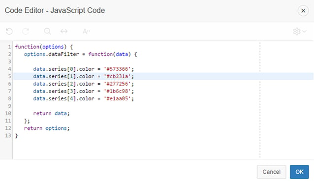
After adding this code, the chart now looks like this.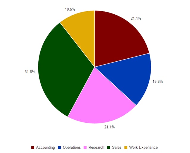
The previous example assumes the chart has a fixed number of data series, to override the colours of a chart with a variable number you can simply alter the code to loop through each data series and set the colour using a custom function.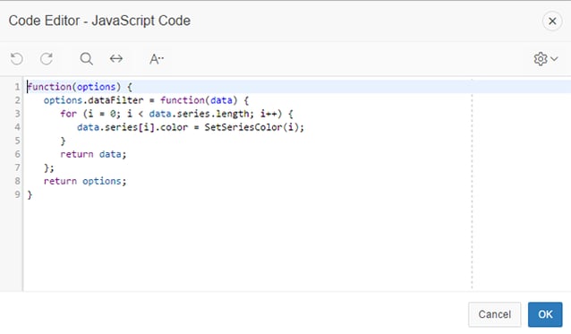
The example above uses a custom function called SetSeriesColor() which has been added to the JavaScript declaration attribute of the page. This function simply returns a colour using the series number from a pre-defined list of 50 colours defined for the application.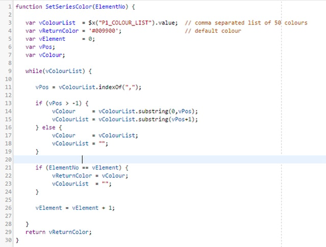
Further Customisations
To see the other configuration options take a look at the ojChart documentation at apex.oracle.com. For example,
You can also call the ojChart API directly from your JavaScript elsewhere within your application. If you have a horizontal bar chart on a page you can very easily add a button with the following code to switch the orientation to vertical. You need to assign a static-id to your chart which you reference with a suffix of _jet.
$(“#static-id_jet”).ojChart({orientation: ‘vertical’});
Fixing colours for multiple charts
If you have a page consisting of multiple charts based upon the same data, you may want to ensure the colours for each series match. Colours are assigned to the series of a chart in sequence, so if your charts don’t have the same number of series, the colours won’t match.
The following example is a page with two pie charts, one detailing the percentage of employees per department and the other detailing the pool cars.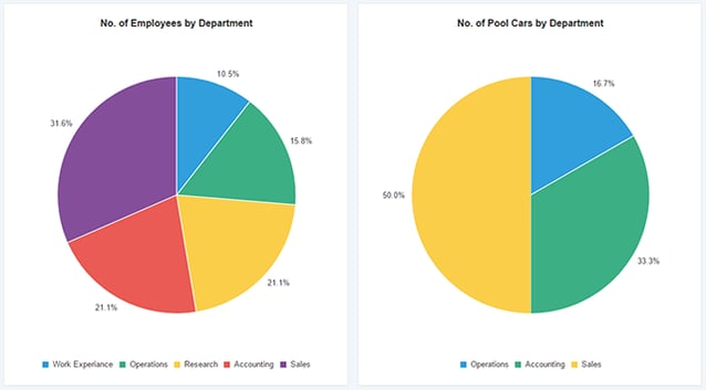
As you can see the colour assigned to each department do not match as there are no pool cars allocated the departments Research or Work Experience. To resolve this, we simply need to modify the SQL for the pool cars query to ensure a row with zero cars is returned for each department. Each query should also be updated to ensure the departments are ordered in the same sequence.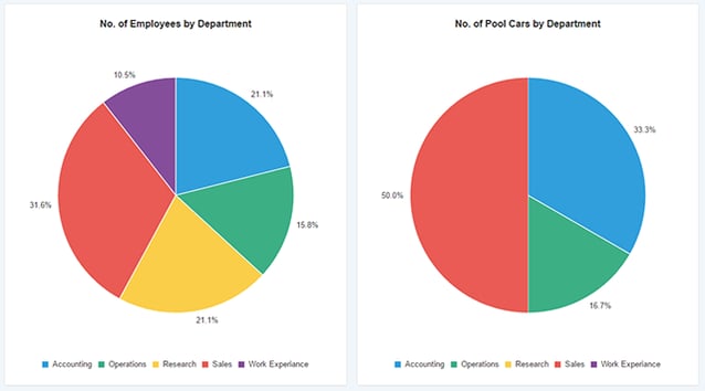
When APEX renders a pie chart, any segments with a value of zero are automatically hidden, however they are still allocated a colour and included within the legend.
If you would like to find out more information speak to one of our Oracle APEX experts, get in touch through enquiries@dsp.co.uk or book a meeting...
Author: Colin Archer
Job Title: Senior Oracle APEX Development Consultant
Bio: Colin is a Senior Development Consultant at DSP with 20 years’ experience of analysis, design, and development of bespoke Oracle applications for a wide variety of business functions. Building on his previous experience of Forms and PL/SQL he is now focusing on developing high quality fit for purpose solutions using APEX.

.png?width=250&name=stonewater-logo%20(1).png)

