- Services

Getting to know us
- Industries
Recent case study:
Oracle EBS Cloud Deployment
Consolidating and Migrating assets into Oracle Cloud Infrastructure.
.png?width=250&name=stonewater-logo%20(1).png)
Most Visited Pages
-
- Resources
DSP-Explorer acquires leading Oracle Applications Managed Services Provider, Claremont, to further extend its data management capabilities.

Resources
- Contact us
Oracle Analytics and the London Marathon
Contents
The 2019 London Marathon on Sunday was record-breaking both in terms of field size and finishing times, with over 42,000 participants and with Kenya’s Eliud Kipchoge shaving 28s off the course record.
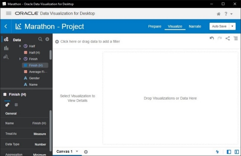
As a data analyst, the release of the London Marathon results presented an opportunity to test drive the analytics capabilities of Oracle Data Visualization Desktop. This is a tool providing a workflow for swiftly gaining insight into data, and exploring trends and correlations through interactive visualizations.
Getting into the data
There is no public dataset, but the official website lists results for all runners since 2014, requiring just a little Python scripting and data wrangling to scrape, clean and aggregate this data. The output dataset consisted of nearly 250,000 race results, covering the Mass Start and Elite running categories, and included gender and age information in addition to finishing times. Here is an overview of the dataset from this year's race.
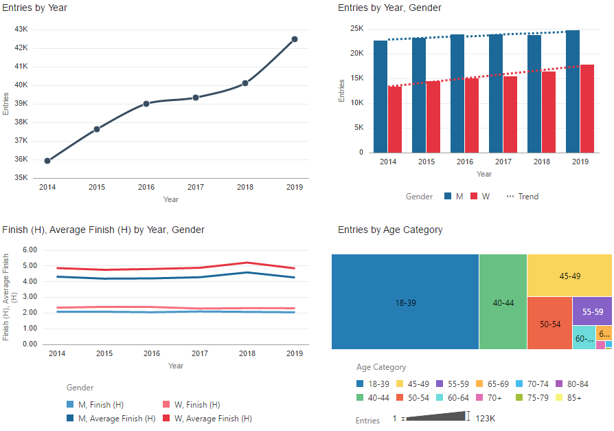
Data Visualization Desktop (DV) makes it simple to produce visualizations depicting both high-level holistic perspectives, and specific connections between variables. We can visualise, for example, growth in field size, trends in both average and fastest times by gender, age distribution, and the gradually equalising proportions of men and women participating.
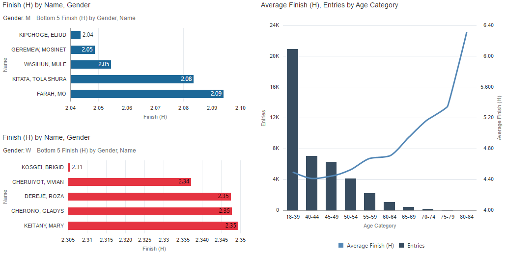
Focusing in on the data from this year, we can easily find the fastest runners of each gender and compare age groups. Interestingly, the analysis of average finishing time against age group exposed a small dip, with athletes aged 40 to 49 being faster on average than their younger counterparts.
Deeper Analysis
A key feature of DV is the ability to draw in multiple datasets from various sources, and visualise these side by side to achieve deeper analytics and understanding.
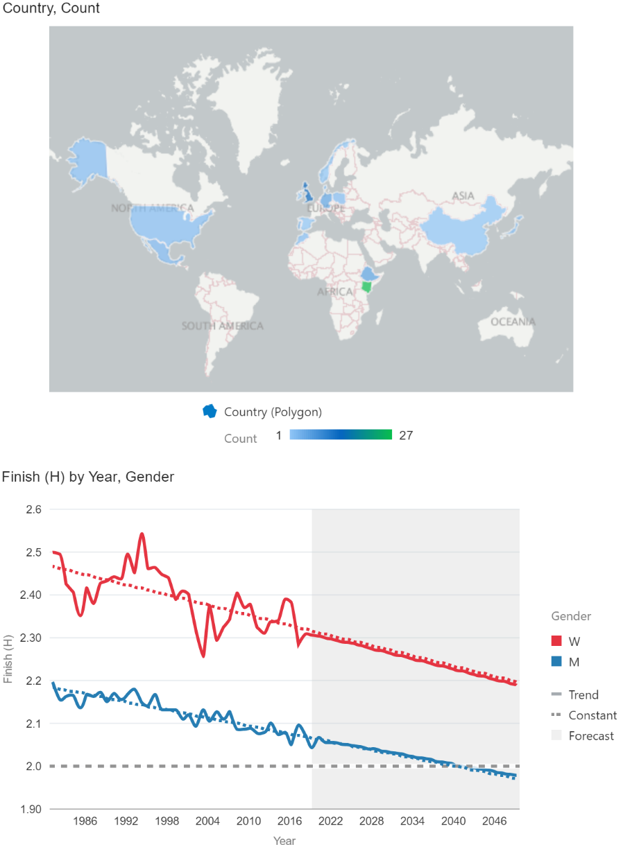
It is possible, for example, to bring in a separate dataset of every race winner since the start of the London Marathon, and visualise this alongside our existing data. We can easily display the distribution of the winners’ nationalities, and the trends in winning finish times. DV is also able to make forecasts based on historical data using the ARIMA (autoregressive integrated moving average) statistical model, showing here that we could expect to wait until 2040 to see a sub-2h time at the London Marathon.
A more powerful application of this tool is the ability to mash together the information in multiple datasets by automatically matching elements and extending the pool of data, thus facilitating deeper exploration and insight into the causes of data patterns and the links between variables.
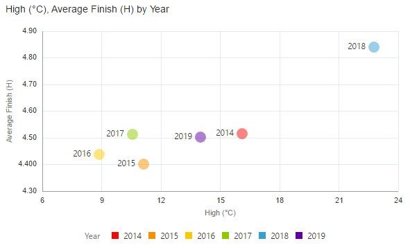
A natural example here would be the weather – how did the temperature on race day each year affect average performance? This was easily answered by importing a small table of daily high temperatures for each race year, linking to the existing data and creating a visualisation of the two variables. The detrimental effect of high race day temperatures is clear.
Or how about a comparison of finishing times for participants in various costumes? The following was produced by linking a lookup table of 25 costumes and corresponding runner numbers to the original dataset. The Big Ben costume wearer who made headlines narrowly beat Tent Man with a time of 3h55, whilst the wearer of a bumble bee costume clocked an impressive sub-3h time.

In Conclusion
While it has been a bit of fun, this analysis clearly highlights the power of Oracle Data Visualization Desktop. This tool provides a streamlined approach to data analytics by facilitating rapid ingest and manipulation of datasets with hundreds of thousands of entries, on-the-fly creation of rich visualizations, and mash-ups with supplementary data to gain deep analysis and insight.