- Services

Getting to know us
- Industries
Recent case study:
Oracle EBS Cloud Deployment
Consolidating and Migrating assets into Oracle Cloud Infrastructure.
.png?width=250&name=stonewater-logo%20(1).png)
Most Visited Pages
-
- Resources
DSP-Explorer acquires leading Oracle Applications Managed Services Provider, Claremont, to further extend its data management capabilities.

Resources
- Contact us
Oracle Data Visualization Cloud Service – Introduction to Visual Analyzer
Contents
Since Oracle has expanded its Data Visualization portfolio, (particularly with the launch of Data Visualization Cloud Service (DVCS) and Data Visualization Desktop (DVD)), I have written a few blogs providing an overview of the two products’ key features, an overview of access controls in DVCS and, more recently, an overview of how to manage data sources.
This month, I will provide an introduction to the key tool for interrogating your data, Visual Analyzer.
DVCS and DVD
Visual Analyzer (VA) in DVCS and DVD are fundamentally the same. DVD does provide some additional functionality – advanced analytics – which is not yet available in DVCS.
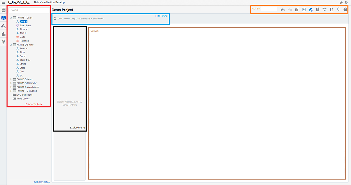
On entry to VA the user is confronted with a page with various components:
- Elements Pane – a list of data sources and their elements
- Explore Pane – area to manage the format of visualizations
- Filter Pane – for the specification of data filters
- Canvas – where visualizations are displayed
- Tool Bar – project level controls e.g. save, undo, new visualization, view mode etc
Data Sources
The first requirement in Visual Analzer is to Add Data Sources to your new project. I covered how this can be done and showed how data from different sources can be mashed up in an earlier blog, an overview of how to manage data sources.
Once you have loaded your data sources into your project, it is possible to manipulate your data using the “Stage” facility (in the tool bar). Stage enables users to perform functions on data sources, without impacting the underlying data. The functions available depend on the data type of the column being manipulated but include those listed in the table below.
| General | String | Number | Date |
| Duplicate | Convert to Number | Convert to Text | Convert to Text |
| Concatenate | Convert to Date | Conditional Group | Year |
| Create Column | Group | Quantile | Quarter |
| Edit Column | Split | Log | Month Name |
| Hide | Replace | Power | Day |
| Uppercase | Square Root | ||
| Lowercase | Exponential | ||
| Sentence Case |
To illustrate, I have shown below, for a data source “Items”, the grouping of items iPhone4, iPhone5, and iPhone6 into one group ‘All iPhones’. An additional, column has been created rather than the raw data being amended.
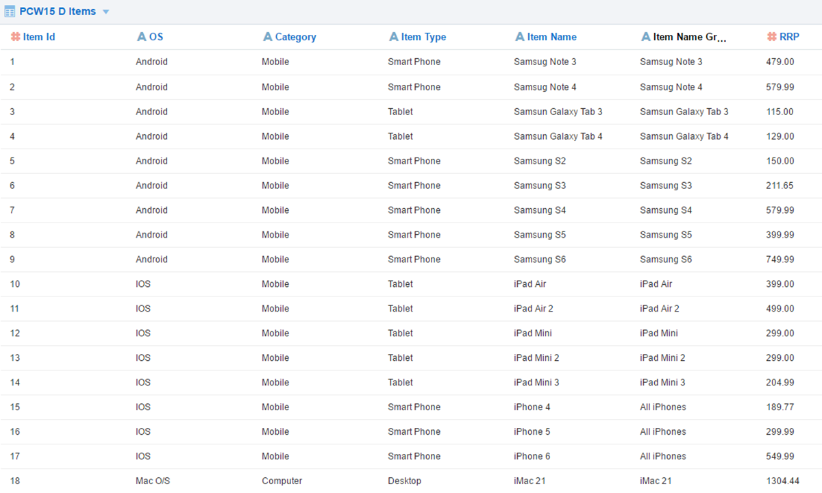
Figure 2. Grouping Item Name
Visualizations
Once you have added your required data sources into your project, you can begin to explore and discover your data in Visual Analyzer.
VA has the ability to automatically suggest the most appropriate visualization to represent your data. Simply select the data elements you would like to report on (in my example below; revenue, item and year) and drag them into the canvas. In this case VA suggests a Horizontal Stacked chart, but this can be changed.
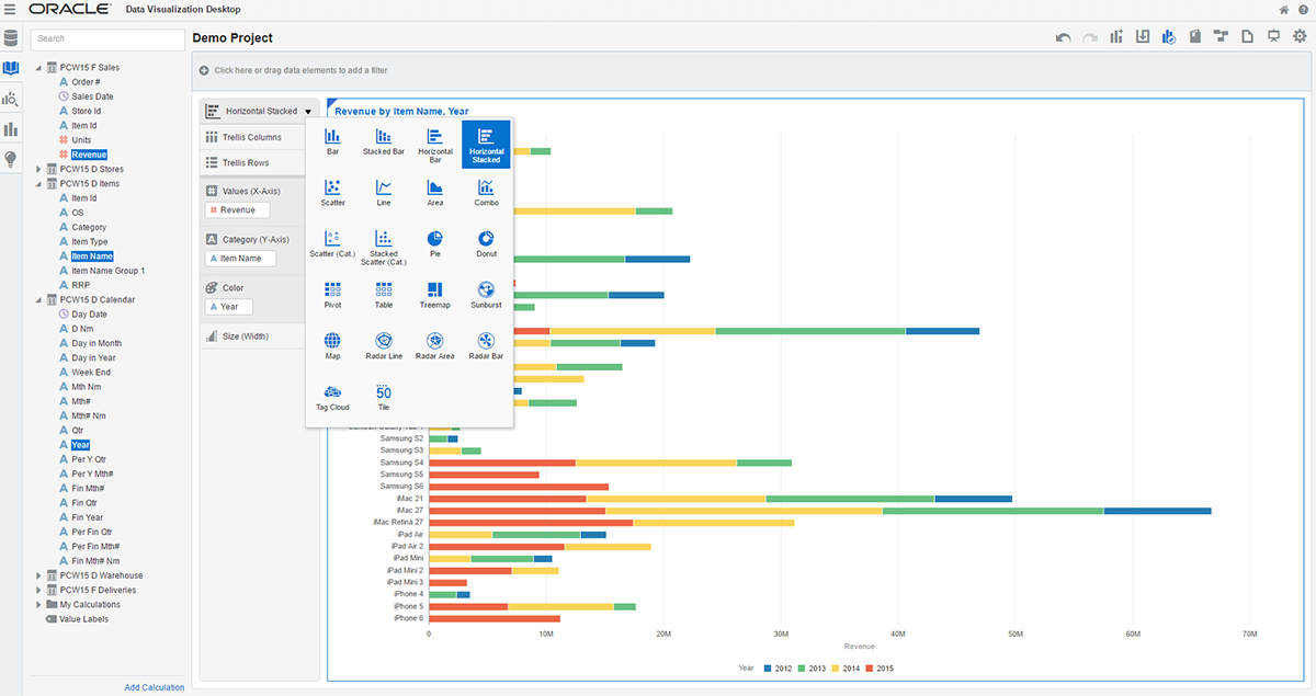
Figure 3. Creating a Visualization
By changing the data items that are in the Explore Pane targets, you can quickly change the look of your visualizations.
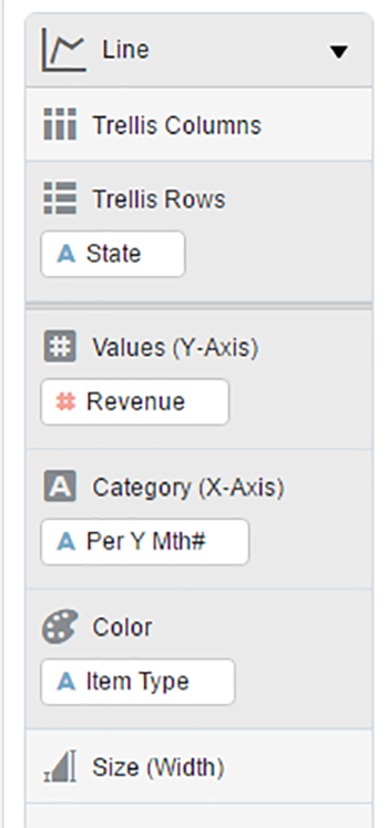
Figure 4. The Explore Pane
The filter pane enables users to enter more specific search criteria using filters by selection, by range e.g. dates or by specifying an expression.
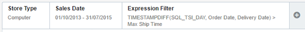
Figure 5. The Filter Pane
Insights and Stories
As users explore the data, they can take snapshots of the visualization that they are developing. These snapshots are called “Insights” and can be managed by selecting the Insights tab. Multiple insights can be amalgamated to tell a story, by being displayed in the Story Navigator (on the tool bar).
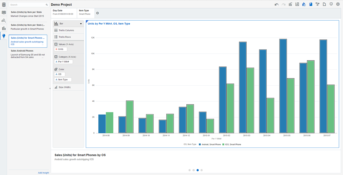
Figure 6. Capturing Insights and Story Navigator
Properties
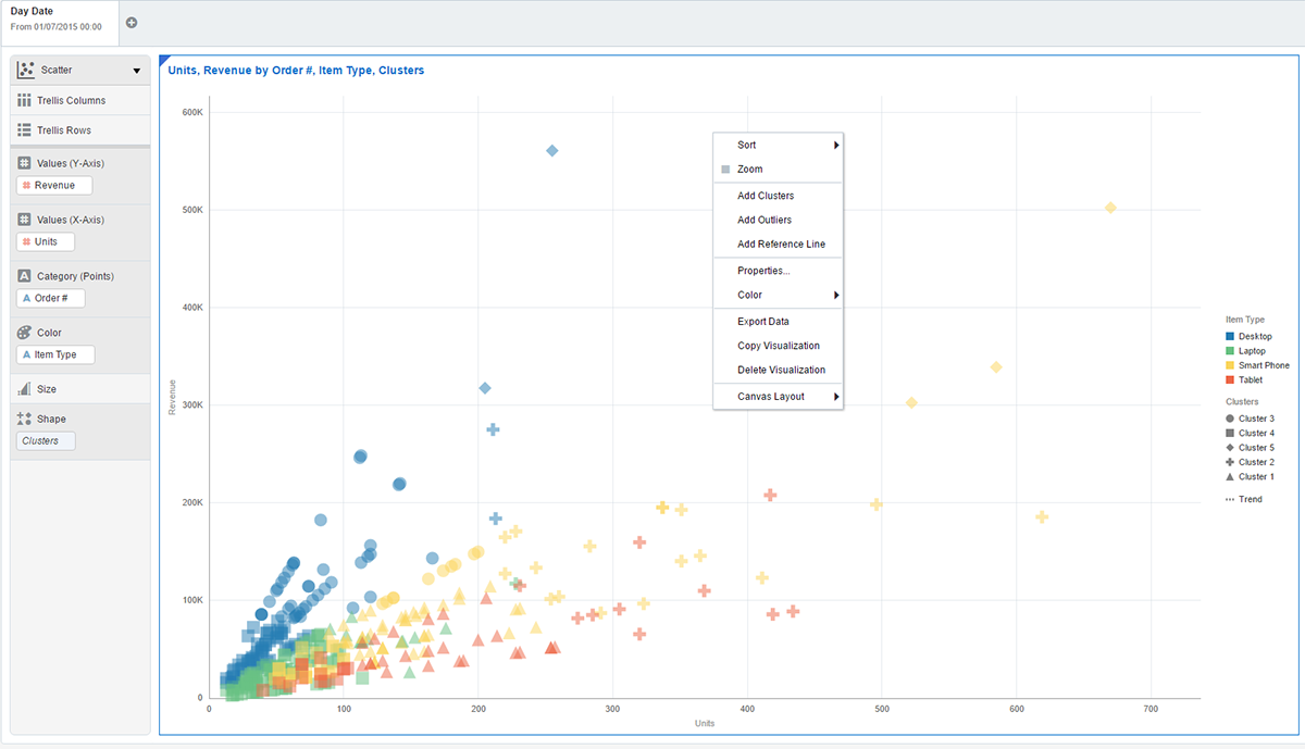
Right-clicking on visualizations and selecting “Properties” allows users to define key features of the visualization e.g. title, axis labels, legend position, values display format, and whether some additional analytics are displayed e.g. reference lines or trend lines.
Advanced Analytics
DVD has the option available to provide some additional, advanced analytics. Access to these requires the installation of Oracle R, the installer for which can be found by searching through All Programs in Windows Start-Up.
Once installed, additional functionality is unlocked, including clustering (to find groups of similar/related data), outlier detection (to highlight abnormal data) and forecasting.
Sharing Content
Once users have explored their data and created visuals that best represent the stories, they can share content with colleagues. For DVD this is limited to export and importing of projects for users of other installations of DVD. For DVCS, depending on user access controls, content can be shared in the cloud, by showing stories in presentation mode, or allowing collaborative working by multiple users on the same projects. An earlier blog, an overview of access controls in DVCS, provides more details on this.
Summary
Visual Analyzer is a powerful tool to enable users to combine data exploration, to discover patterns and trends across multiple data sources, with the ability to storyboard the results in rich visuals.
Trial Data Visualization
Both DVCS and DVD are available to use to trial / evaluate:
- DVD no-production version available from OTN: Download DVD now from OTN
- DVCS available for 30 day free trial: Data Visualization Cloud Service (DVCS) and click ‘Free Trial’
Other Links
- Oracle Data Visualization Desktop community
- Oracle Help Center: Oracle Data Visualization Cloud Service – Get Started
- Oracle Help Center: Oracle Data Visualization Desktop – Get Started
- Oracle Help Center: Using Oracle Data Visualization Cloud Service – Adding Your Own Data
Author: Philip Ratcliffe
Job Title: Oracle APEX Development Consultant
Bio: Philip is a Development Consultant at DSP-Explorer. Building on considerable experience in development including using Oracle PL/SQL and supporting Oracle EBS, Philip is employing APEX to provide quality, bespoke software solutions to a range of organisations.