- About
Getting to know us
- Services
- Managed Services
- Application Services
- Cloud Services
- Data Science
- Consulting Services
- Technology Solutions
Managed Services
Application Services
Data Science
Consulting Services
Technology Solutions
- Industries
- Resources
Resources
- Contact
- Contact us
APEX 5.0 Desktop Universal Theme vs Mobile Theme
Contents
I was recently asked by a customer to create a small application for use on mobile devices, to record attendance at certain events.
Developing in APEX version 5.0, I initially built the application using a Mobile application, but for comparison also built the same functionality using a Desktop application using the Universal Theme.
This blog looks to compare some of the features of these two approaches.
Theme
The customer in question was already using a large application based on the Universal theme Vita-Slate style. When creating a Mobile application there is a choice of three colour theme styles (blue, dark, red) for a single Mobile (51) theme.
So, although the new functionality was in a separate application, the Universal theme had the advantage of being able to offer a style consistent with the customer’s existing application.
Menu Page
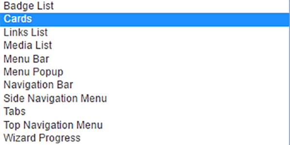
The first page I needed to create was a menu page. Although, initially there was just one area of functionality required for the new application, I needed to allow for scope for the application to grow. Having decided to base my menu on a List, I was also struck by the relatively limited number of list template options available in the Mobile theme.
Figure 1. List Templates available in Mobile theme (top) and Desktop Universal theme (bottom)
The Mobile theme includes the List View template, (screenshot below), which is not included in the Universal Theme.
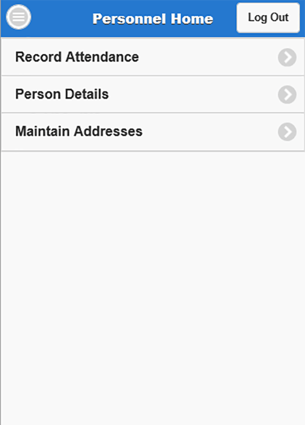
Figure 2. Mobile theme List View template
Calendar Pages
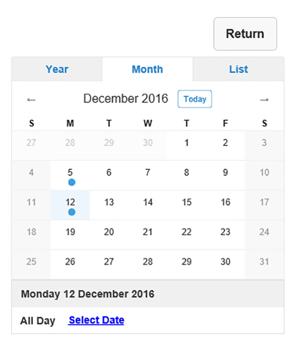
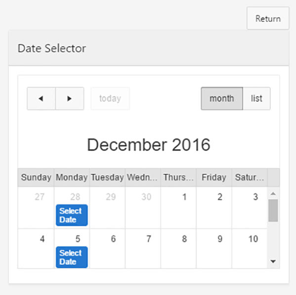
As part of the functionality a user was allowed to select a date when an event took place. In order to manage this, I used a calendar type region in both applications. The configuration of these in Page Designer was the same in both applications. If anything, the way the page is rendered is slightly nicer in the Mobile application. But the Universal theme page had the advantage of being a one-touch selection. Whereas the Mobile application required a two-touch process (selecting from the calendar, then confirming by touching the listed link)
Figure 3. Calendar region in Mobile theme (top) and Universal theme (bottom)
Reports
One of the key differences between Mobile theme and Universal theme is the options for reporting. In Universal theme the main choice is between Interactive reports and Classic reports. In Mobile theme these are not available but Column Toggle reports or Reflow reports are. Column Toggle reports allow the end user to select at run time which columns of the report are displayed (to allow them to adjust displays to reflect screen sizes). This wasn’t appropriate for my application’s requirements, so I opted for a Reflow report for my Mobile-themed application. These are responsive reports that transform from displaying in columns to displaying in rows on smaller screen sizes.
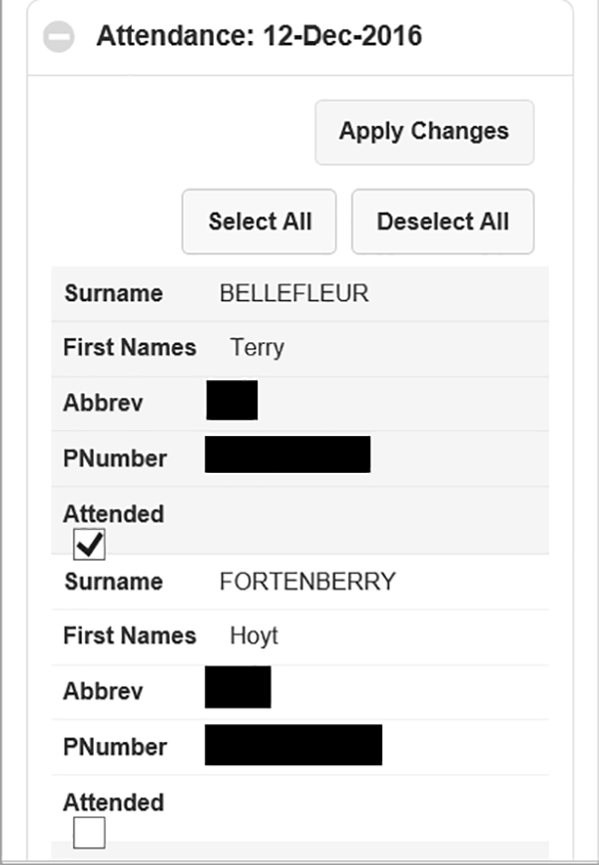
However, in the report, I was using a checkbox to toggle between attendance and non-attendance of an individual at an event, and I don’t think it rendered particularly nicely.
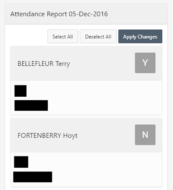
Using a classic report in Universal theme allowed me to use the Cards template (not available with Reflow reports), which renders really nicely on screens of various sizes. With one card per person, the user can toggle between attendance and non-attendance simply by tapping the relevant card.
Figure 4. Mobile theme Reflow report (left) and Universal theme Classic report with Cards (right)
Developer Tool Bar
Another benefit of Desktop applications over Mobile applications, that as a developer is very quickly apparent, is that the Developer Tool bar is absent from Mobile. This is invaluable for debugging and checking session state. It can be generated in Mobile applications by employing some open source code to a PL/SQL Dynamic Content region type to your Global Page, but it’s absent out of the box.
List of Available Components & Dynamic Action Events
The table below provides a list of the dynamic action events and regions and items that are available to the Mobile and Universal themes.
Note: The dynamic action actions are not listed. The list of those available to the two different themes is very similar, with just the Collapse Tree and Expand Tree component actions available to the Universal theme that aren’t to the Mobile theme.
| Options Available Between Mobile and Universal Themes | |||||
| Mobile | Universal Theme | Mobile | Universal Theme | ||
| Dynamic Action Events | Components | ||||
| Browser Events | Regions | ||||
| Change | Y | Y | Breadcrumb | Y | Y |
| Click | Y | Y | Calendar | Y | Y |
| Double Click | Y | Chart | Y | Y | |
| Key Down | Y | Y | Classic Report | Y | |
| Key Press | Y | Y | Classic Report (based on Function) | Y | |
| Key Release | Y | Y | Column Toggle Report | Y | |
| Get Focus | Y | Y | Help Text | Y | |
| Lose Focus | Y | Y | Interactive Report | Y | |
| Mouse Button Press | Y | Legacy Calendar | Y | ||
| Mouse Button Release | Y | List | Y | Y | |
| Mouse Enter | Y | List View | Y | ||
| Mouse Leave | Y | Map Chart | Y | ||
| Mouse Move | Y | PL/SQL Dynamic Content | Y | Y | |
| Orientation Change | Y | Reflow Report | Y | ||
| Page Load | Y | Y | Region Display Selector | Y | |
| Page Unload | Y | Y | Static Content | Y | Y |
| Resize | Y | Tabular Form | Y | ||
| Resource Load | Y | Y | Tree | Y | |
| Scroll | Y | Y | URL | Y | Y |
| Scroll Start | Y | ||||
| Scroll Stop | Y | Items | |||
| Select | Y | Y | Checkbox | Y | Y |
| Swipe | Y | Color Picker | Y | ||
| Swipe Left | Y | Date Picker | Y | ||
| Swipe Right | Y | Date Picker (HTML5) | Y | ||
| Tap | Y | Display Image | Y | Y | |
| Tap and Hold | Y | Display Only | Y | Y | |
| Touch Cancel | Y | File Browse | Y | Y | |
| Touch End | Y | Hidden | Y | Y | |
| Touch Move | Y | List Manager | Y | ||
| Touch Start | Y | Number Field | Y | Y | |
| Virtual Click | Y | Password | Y | Y | |
| Popup LOV | Y | Y | |||
| Framework Events | Radio Group | Y | Y | ||
| After Refresh | Y | Y | Rich Text Editor | Y | |
| Before Page Submit | Y | Y | Select List | Y | Y |
| Before Refresh | Y | Y | Shuttle | Y | |
| Dialog Closed | Y | Y | Slider | Y | |
| Text Field | Y | Y | |||
| Component Events | Text Field with autocomplete | Y | |||
| Change Order (Shuttle) | Y | Textarea | Y | Y | |
| Yes/No | Y | Y | |||
Summary
My experience of using the APEX Mobile theme alongside Universal theme has really shone a light on how well the responsive design of Universal theme works. I have found that the options of additional region types (and templates) and item types within Universal theme mean that applications can be developed that are just as suitable for devices of all sizes as Mobile themed applications. Indeed, some items such as Pop-up LOVs, render more nicely in Universal theme, and by using the additional features of Universal theme other functionality can be presented in a more attractive way. And, with out-of-the box provision of the developer tool bar it’s easier to work with too.
However, if you intend that users of your application trigger events with movements more associated with mobile device use (such as swipe, tap, touch and orientation change), you may be better served taking advantage of the Dynamic Action events available in the Mobile theme (although events such as ‘click’ and ‘select’ that are available to the Universal theme may be suitable alternatives).
Author: Philip Ratcliffe
Job Title: Oracle APEX Development Consultant
Bio: Philip is a Development Consultant at DSP-Explorer. Building on considerable experience in development including using Oracle PL/SQL and supporting Oracle EBS, Philip is employing APEX to provide quality, bespoke software solutions to a range of organisations.

.png?width=250&name=stonewater-logo%20(1).png)


