- About
Getting to know us
- Services
- Managed Services
- Application Services
- Cloud Services
- Data Science
- Consulting Services
- Technology Solutions
Managed Services
Application Services
Data Science
Consulting Services
Technology Solutions
- Industries
- Resources
Resources
- Contact
- Contact us
The Premier League meets Power Bi: Part 1
Contents
What makes the Premier League?
Analysis of the 2018/19 Premier League Season using Power Bi
Since the new Premier League football season kicked off recently, I decided to run an analysis into the previous season: I wanted to see if Power Bi could break down ‘the stats that win the league’ to answer that all-important question – can we predict the winner of the Premier League using Data Science?
Below are my findings, complete with visuals created in PowerBI and predictive models in R. Through various sources I found an array of data, including statistical breakdowns of the individual matches and financial data about the teams, which were useful in trying to determine how the league is won.
I've split my findings into 3 parts, of which Parts I and II (The Stats) are covered in this article, and Part III will be coming soon.
Part I: The Stats
Northern Powerhouse
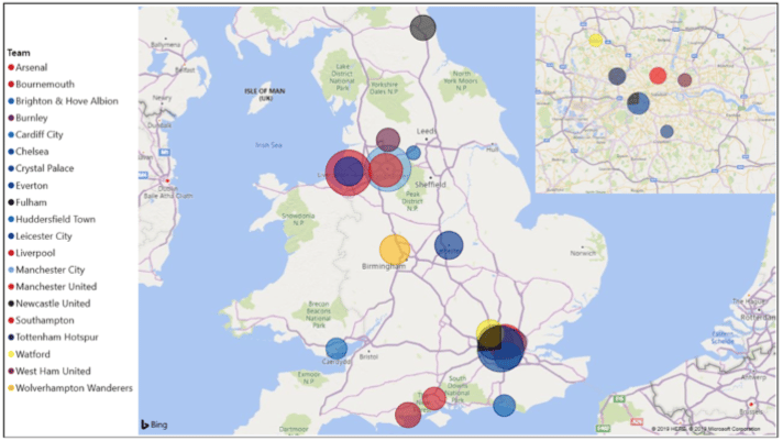
This season the Premier League stretched geographically from Newcastle in the North-East to Bournemouth on the South coast. The points in the image below are scaled by the number of points scored by the teams based at each location (and because the home stadiums of Chelsea and Fulham are in the same London borough, I’ve added a pie chart for clarity).
We can see here that the two strongest areas of the country for football this season were the North-West and London, with six competing teams based in the North-West and seven teams based in London. This is standard for the Premier League, as 26 of the 27 league titles have been won by a team in one of these regions, with the only exception being 2015-16 champions Leicester City.
The Stats that Win the League
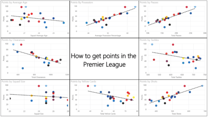
Many different factors, and combinations of those factors, can be translated into points for a premier league team. The factors shown below are (clockwise from the top-left): squad age, possession, passes, tackles, shots, yellow cards, squad size, and defensive clearances.
Here we see a positive linear relationship between points and possession, passes, and shots, and a negative linear relationship between points and defensive clearances, yellow cards and defensive tackles. This might lead us to believe that you can win the league by simply keeping the ball, passing it around, and shooting a lot. Someone should tell Ole Gunnar Solskjaer!
Of the statistics shown in the table above, the least useful variables are squad size and tackles. There does not appear to be a relationship between squad size and points, thus this variable is unlikely to be useful when building a model for the data.
The negative trend of defensive tackles to points seems to be heavily influenced by the outlier that is Manchester City, and statistical analysis may show that there is not a strong enough relationship here to justify including this variable in a predictive model.
Part II: Money and Mediocrity
The Billion Pound Team
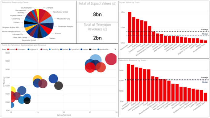
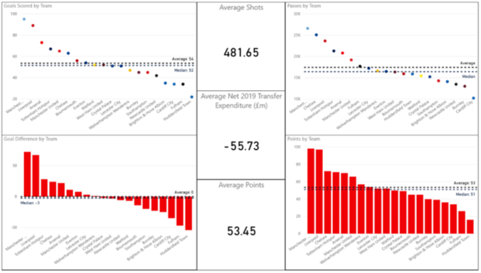
Players in the premier league last season had a combined market value of £8bn, which is four times the size of the yearly TV revenue of approximately £2bn. This money is not spread evenly; Manchester City, for example, have a squad worth one billion pounds sterling. This wealth injustice is made evident by the disparity between the average and the median market values of the teams.
The top six clubs form an elite group who scored the most goals, earned the most points and comprised almost half of the televised teams in the premier league this season.
Hyperinflation in the transfer market – A small country of spending
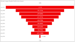
The funnel diagram shows how the Premier League has progressed from a net £20m spend in the 2010 transfer market to a net £1.1bn spend in the 2019 transfer market, an incredible 67 times increase. The gross expenditure by the teams was nearly £1.5bn this season, approximately equal to the GDP of the West African country Guinea-Bissau.
It Pays to be Interesting
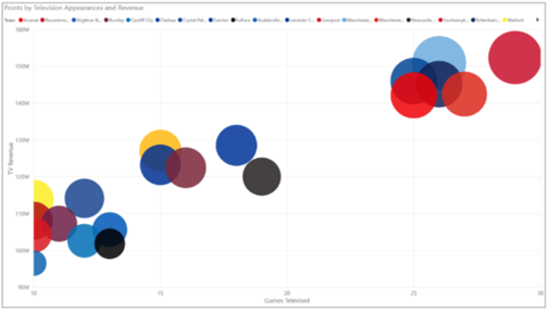
The top six sides are all involved in many more televised games than any of the other teams. This is no doubt both a result of and a cause of their success, with televised games being chosen for their intrigue at the top of the league table, and with money the teams earn from these televised games allowing them to invest more into their teams than many of the lesser achieving teams.
Four of the teams only had ten televised games each, which is the contractual minimum that the broadcasters can show. These teams were the midtable Southampton, Bournemouth and Watford, and bottom placed Huddersfield town, whose positions in the league did not cause much interest as they were not involved in a fight for European football, or a fight to survive in the Premier League. These teams had just over a quarter of their games televised, whereas Liverpool had three-quarters of their games televised.
Leicester City – The Most Average Team
A team that certainly wasn’t boring in the previous few seasons, Leicester City managed to earn 52 points in the Premier League this season, just one point off the average. They also managed to achieve a particularly average number of goals scored, goal difference, passes attempted and yellow cards, with an average pass accuracy, and even an average television revenue for the season.
Other teams in the running for this prestigious crown, based on many of these statistics, are Everton, Wolves, and West Ham. These four ‘average’ teams finished a slightly above-average 7th-10th in the table, demonstrating the positive skew in the league caused by the large disparity between the top six teams and the rest of the league.
Check out the final part of this article by clicking here to answer the big question - can data analytics be used to predict the outcome of this season's Premier League?

.png?width=250&name=stonewater-logo%20(1).png)

