- About

Getting to know us
- Industries
Recent case study:
Oracle EBS Cloud Deployment
Consolidating and Migrating assets into Oracle Cloud Infrastructure.
.png?width=250&name=stonewater-logo%20(1).png)
Most Visited Pages
-
- Resources
DSP-Explorer acquires leading Oracle Applications Managed Services Provider, Claremont, to further extend its data management capabilities.

Resources
- Contact us
Making informed predictions about Bitcoin with Business Intelligence
Contents
Since Bitcoin’s inception, it has regularly made headlines, which in turn affects its price. Be it Elon Musk tweeting, technology stocks reaching new highs or lows, crude oil prices taking a dip, or rising globally, they all have an influence. The DSP-Explorer innovation team recently investigated how to measure the relationship between these external metrics and Bitcoin’s value, how they’re affecting it now, how to visualise that data, and crucially, how to act upon it (before you read on, you can find out more about our Business Intelligence services here).
We considered the scenario of a professional trader looking to make informed predictions and decisions. We created a dashboard to show the correlation of Bitcoin with other external factors, and see which metrics were affecting Bitcoin price the most over a given time span.
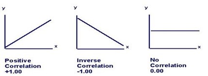
What is a Correlation Coefficient?
First, let’s define the Pearson Correlation Coefficient, (casually called the 'correlation coefficient' in everyday use by default).
A correlation coefficient is a value between 1 and -1, signifying the relationship between two variables. The three states that are important to us are as follows:
- A value of 1 or close to 1 means the two are directly proportional or positively correlated (if one variable rises, the other rises too)
- A value of 0 or close to 0 means the two have no significant relationship
- A value of -1 or close to -1 means the two are inversely proportional or negatively correlated (if one variable rises, the other falls)
How will correlation translate with time series data for Bitcoin price?
If two variables are highly positively correlated (value close to 1) with respect to time, they will rise and fall at the same time, or one will follow the other immediately after or before as shown below where the Bitcoin price is positively correlated with the NASDAQ-100 Index.
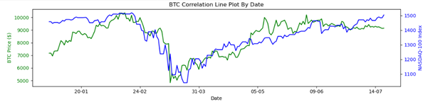 The opposite happens when they’re negatively correlated (values close to -1) i.e. if one variable rises, the other falls. No trend is observed with respect to time if there’s no correlation (values close to 0). It is to be noted that correlation does not equal causation, but the causation doesn’t always matter to some professionals like traders whose key concern is taking profits and therefore context doesn’t matter. Correlation visualisations with respect to time are a part of technical analysis for stocks/bonds/securities/crypto assets etc. and are one of the popular charting techniques to analyse relationships between two assets.
External factors to be compared with Bitcoin price:
These metrics are often cited to be highly correlated to Bitcoin price at varying times of the year. They will be mentioned by their column names in our report, which are self-explanatory:
- S&P-500 Index: The Standard and Poor's 500, or simply the S&P 500, is a stock market index tracking the stock performance of 500 large companies listed on exchanges in the United States (US)
- NASDAQ-100 Index: A stock market index consisting mainly of 100 large technology companies in the US. This index is of prime interest to investors interested in new tech and startups
- Oil Per Barrel ($): Daily closing price of a barrel of Brent crude oil in US dollars
- Interest Index: A value between 0 and 100 from Google Trends measuring the level of interest in the keyword “Bitcoin”. A value of 100 or close to it indicates a level of high interest online and values of 0 or close to it signify little to no interest
- Gold & Silver Index: This is the Philadelphia Gold and Silver Index, which is an index of thirty precious metal mining companies that are traded on the Philadelphia Stock Exchange.
All the above factors will be compared to the daily closing price of Bitcoin in US dollars.
Extracting and transforming data:
The data for the daily closing price of Bitcoin, total transactions, and other internal metrics are imported from Blockchain.com through the Quandl API key. The data for the gold and silver index, S&P-500, NASDAQ-100, and the daily closing price of Brent crude is imported from Yahoo Finance. The data for the interest index is imported from Google Trends. All the data from these sources were extracted and combined via a python script, and then transformed in the Power Query editor.
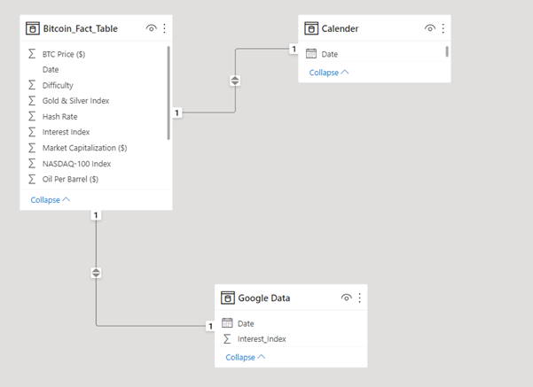
After transforming the data, a fact table containing all these metrics was linked to two other dimension tables i.e. the Date and Google Data. A separate table called 'Date' was made so it can act as our calendar to slice our data into smaller chunks like quarters, months, weeks, days of the week, etc. Adding such timeframes to our fact table would only unnecessarily enlarge it. The second table called 'Google Data' was made because extracting the interest index data for every day from Google Trends via a Python script takes a lot of time. Therefore, the Python script is run and imported separately from our fact table to save time when our connectors are refreshed to include the latest data points. The relationships are established as shown below:
The final product:
We make the correlation report as follows: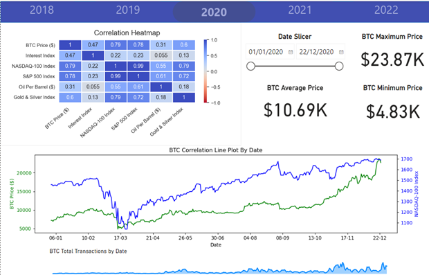
The report is divided into five years, and each year has a separate tab with a date slicer. The data on the report automatically updates when the dates are changed for that specific year. Both, the correlation heatmap and the correlation line plot by date, are made via Python scripts to interact with each other, whereby the highest correlated feature to Bitcoin price in the selected timeframe is plotted against it automatically on the line plot below on the secondary Y-axis.
The rest of the visuals are native in Power-BI, including the navigation pane at the top, the area chart showing the transaction volume of Bitcoin by date at the bottom, and other cards showing the minimum, maximum and average Bitcoin price for the selected timeframe. A quick demo of how the dashboard works below: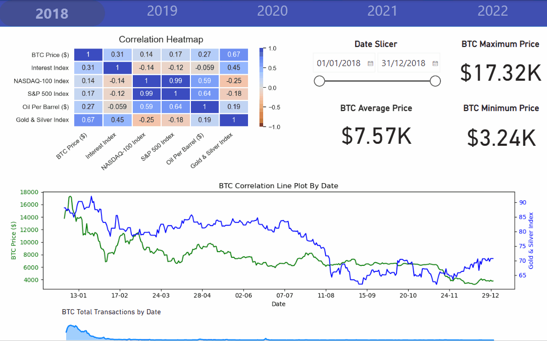
How can this dashboard be of help?
The dashboard can be used to compare what correlations persisted in each year historically. The time can also be sliced for each year to narrow down to areas of high volumes of trade to see which correlations dominated during that period. It can also be used, by a professional trader, to open long or short positions based on the latest data coming from the API and see which metric is the highest correlated now. Finally, it can also be used to see the average, maximum and minimum bitcoin daily closing price over a time frame.
For more information about how we can help you bring innovative reporting and insight to your business, get in touch with our Innovation Team to find out more about our Data Science Services.