- About
Getting to know us
- Services
- Managed Services
- Application Services
- Cloud Services
- Data Science
- Consulting Services
- Technology Solutions
Managed Services
Application Services
Data Science
Consulting Services
Technology Solutions
- Industries
- Resources
Resources
- Contact
- Contact us
What is new in Oracle APEX version 5.0?
Contents
Apex 5.0 will soon be available and there are a host of new features allowing developers to create web based applications with increased ease and efficiency. Here are a few of the features that I have found most useful while trying out the early adopter environments.
Page Designer
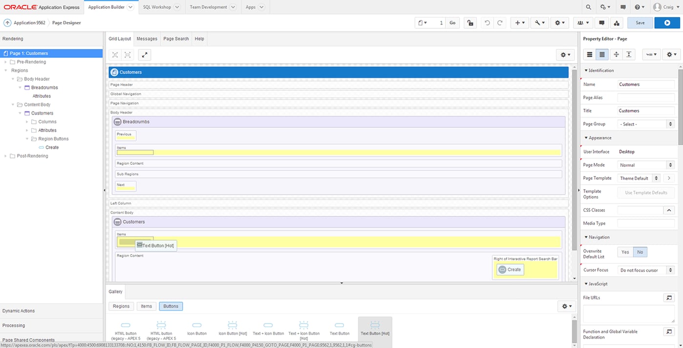
The most prominent new feature in Apex 5.0 is the new Page Designer interface. It is very different from the previous component and tree views, incorporating all the development options on a single screen.
The tree view from 4.2 has now been condensed down into the accordion on the left hand side of the screen. The rest of the screen is taken up by a large Grid Layout area allowing drag and drop page design, and a Property Editor area that allows access to all the component attributes previously found on the edit screen.
This new interface allows us to develop much more efficiently. Instead of editing individual items and navigating away from the page you were looking at, we can now simply click on a component in the Tree View or Grid Layout and then alter the attributes directly in the Property Editor. It is also now possible to select multiple components and then alter any common attributes in the Property Editor, without the need for editing each individual item. There is now also the option to undo and redo any changes made in the Property Editor or Grid Layout as changes are not saved until the save button is pressed or the application is run.
Another welcome addition is the Code Editor, with native syntax highlighting, inline error highlighting and autocomplete functionality it is now easy to write PL/SQL code from within Apex itself, without the need for a separate developer window.
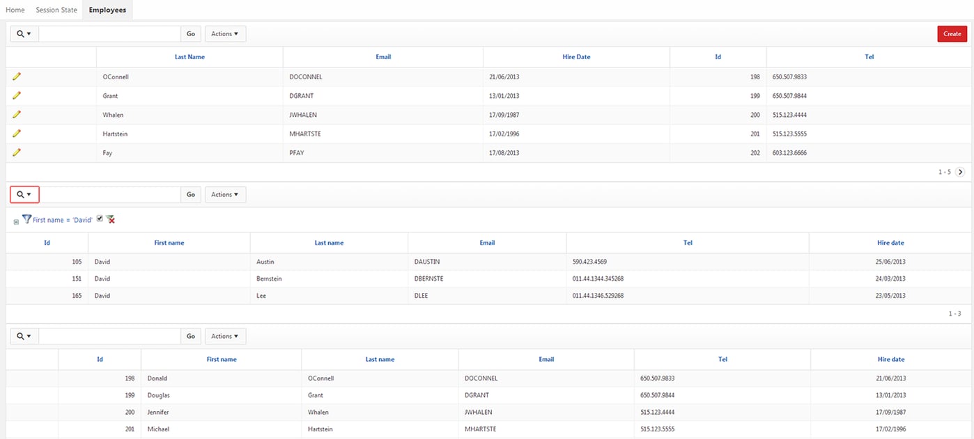
Multiple Interactive Reports
It is now finally possible to include multiple interactive reports on the same page. The report regions can simply be dragged to the desired area of the page using the Grid Layout and once the S
QL has been entered, the reports can be manipulated individually from the same page as in the screenshot below.
Themes
The new Universal Theme 42 is very simple and attractive, with flat grey and blue buttons and regions. The theme utilises CSS3 and HTML5 which makes altering the look of your application extremely straight forward.
The jQuery Mobile 1.4 mobile theme has also been improved upon, with reflow tables available out of the box. These report regions wrap a row’s column data into vertically arranged sub regions to display them on small screens. There is also the option to toggle less important columns to be hidden on smaller screens. There is also due to be a tablet specific theme available in the next release.
JQuery Mobile swatches are supported by the new theme, making it extremely easy to add your own style using the ThemeRoller application.
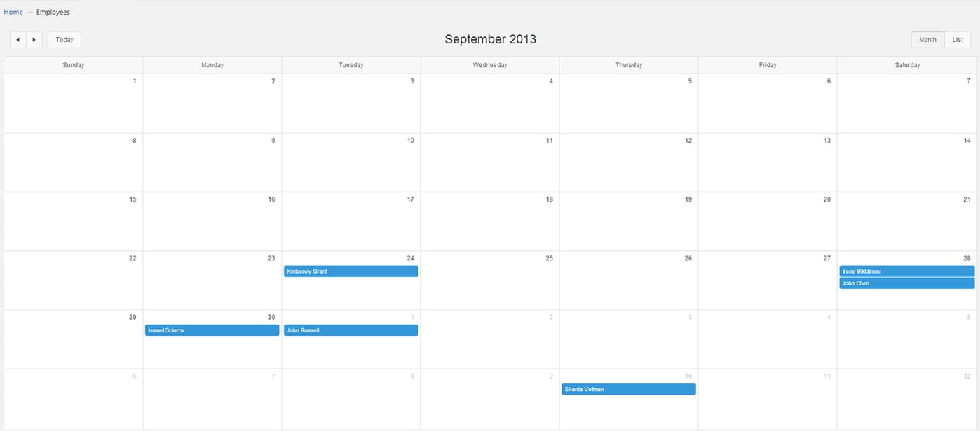
Calendar
A new calendar region has been included that allows you to generate a responsive CSS calendar based on a SQL query. You can configure which columns in the query refer to the date and display value. This calendar is a native implementation of the FullCalendar plugin that can be integrated with Google Calendar.
Summary
I’m really looking forward to the full release of Apex 5.0. With the new page designer view presenting everything on a single screen, creating and editing Apex page items is now as simple as it can be. This, along with the other improvements mentioned above, really helps make Apex the single tool for Oracle application development. It feels like Oracle are focusing on productivity and ease of use with this new release which is certainly welcome and will allow both experts and newcomers to build applications faster than ever.
Author: Craig Sykes
Job Title: Senior Oracle Development Consultant
Bio: Craig is a Senior Development Consultant at DSP-Explorer. Craig has an MSc in Computing Science and is an experienced software engineer, utilising development tools such as PL/SQL and APEX to provide bespoke ERP software to both UK and international businesses. Craig has experience developing solutions to connect Oracle systems to a wide range of existing external applications within business environments.

.png?width=250&name=stonewater-logo%20(1).png)

