- About

Getting to know us
- Industries
Recent case study:
Oracle EBS Cloud Deployment
Consolidating and Migrating assets into Oracle Cloud Infrastructure.
.png?width=250&name=stonewater-logo%20(1).png)
Most Visited Pages
-
- Resources
DSP-Explorer acquires leading Oracle Applications Managed Services Provider, Claremont, to further extend its data management capabilities.

Resources
- Contact us
Revolutionise Your APEX Development with Template Components
Contents
Oracle APEX 23.1 introduced a groundbreaking new feature: Template Components. This functionality allows you to create, implement, and share your own reusable UI components within APEX. These fully declarative components can either be rendered standalone or as regions displaying one or multiple rows of data.
In this blog, I will walk you through the creation and implementation of a Template component for a basic product card styled with Google’s Material Theme.
Create your HTML component
You can use sites like codepen.io for this if you need to make something bespoke, or it is also a great place to find boilerplate code which you can tweak to your requirements.
Here’s one I created to use for our card:
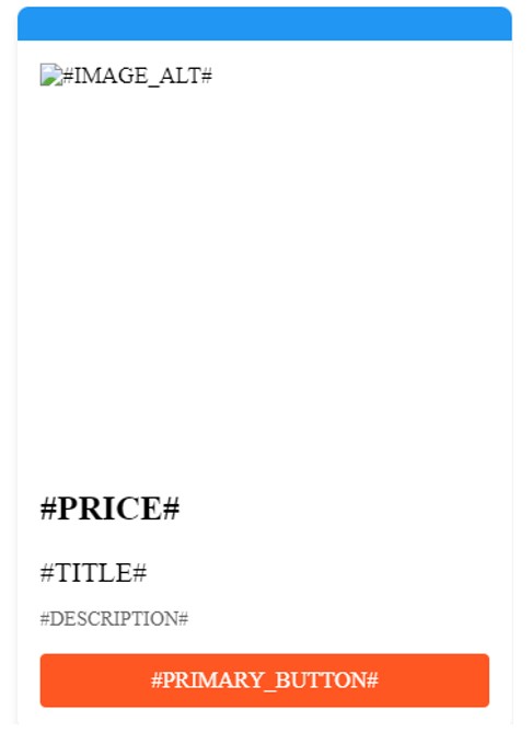
<div class="card">
  <div class="card-header"></div>
  <img class="product-image" src="#IMAGE_URL#" alt="#IMAGE_ALT#">
  <div class="card-content">
    <h2 class="price">#PRICE#</h2>
    <h2 class="product-title">#TITLE#</h2>
    <p class="product-description">#DESCRIPTION#</p>
    <div class="buy-button">#PRIMARY_BUTTON#</div>
  </div>
</div>
You will notice the use of APEX substitution strings; these allow our components to be dynamic.
I then fed this HTML to an AI tool (I used Bard on this occasion) and prompted it to give me the CSS to style this using the Google Material Theme that it duly obliged, and after some slight tweaks in codepen - we have the CSS for our basic card:
/* Google Material Theme Colors */
:root {
    --primary-color: #2196F3;
    --accent-color: #FF5722;
}

/* Reset some default styles */
/* Card Container */

.card-container {
  width: 100%;
  flex-wrap: wrap;
  display: flex;
  align-items: center;
  justify-content: flex-start;
}

.card {
    min-height: 220px;
    max-width: 350px;
    position: relative;
    background-color: white;
    border-radius: 8px;
    box-shadow: 0px 4px 6px rgba(0, 0, 0, 0.1);
    margin: 20px;
}

/* Card Header */
.card-header {
    background-color: var(--primary-color);
    color: white;
    padding: 12px;
    text-align: center;
    border-top-left-radius: 8px;
    border-top-right-radius: 8px;
}

/* Product Image */
.product-image {
    padding: 1em;
    /* max-width: 100%; */
    height: 250px;
    width: 230px;
    display: block;
    border-radius: 8px 8px 0 0;
}

/* Card Content */
.card-content {
    padding: 16px;
    color: black;
}

/* Product Title */
.product-title {
    font-size: 20px;
    font-weight: 500;
    margin-bottom: 8px;
    color: black;
}

/* Product Description */
.product-description {
    font-size: 14px;
    color: #666;
    margin-bottom: 16px;
}

/* Buy Button */
.buy-button {
    display: block;
    background-color: var(--accent-color);
    color: white;
    text-align: center;
    padding: 10px;
    border: none;
    border-radius: 4px;
    cursor: pointer;
    transition: background-color 0.2s;
    text-decoration: none;
}

.buy-button:hover {
    background-color: #E64A19;
}

.card:hover {
  transform: translateY(-5px);
  box-shadow: 0px 2px 4px rgba(0, 0, 0, 0.2);
}
Here is the resulting card:

Create the Template Component in APEX
So now we have the HTML and CSS for our component, we need to create a plug-in with our code.
- Within your application, go to Shared Components -> Plug-ins -> Create -> From Scratch.
- Populate the name and set the template to Multiple (Report)
- Some code will be generated, giving you examples of template directives which allow further flexibility. More info on template directives
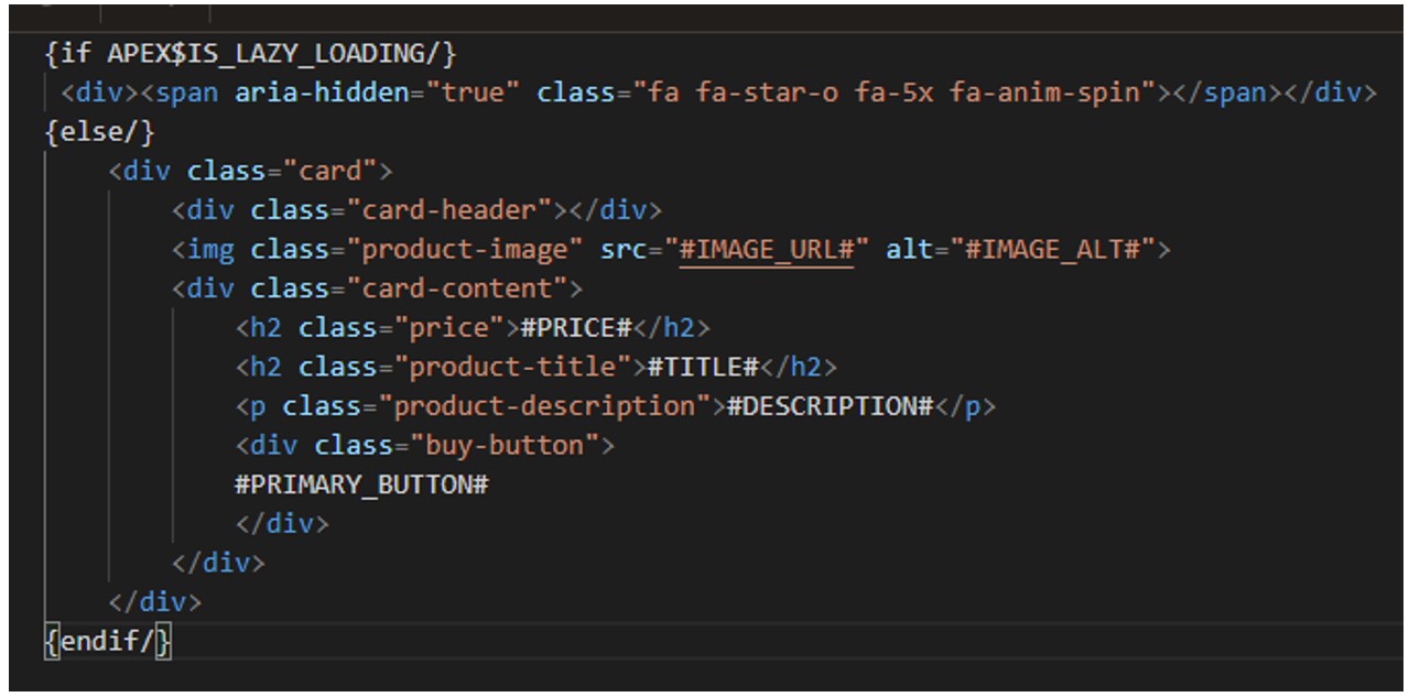
- I’ve removed the directives other than lazy loading options, where I have added the spinner and our card HTML:
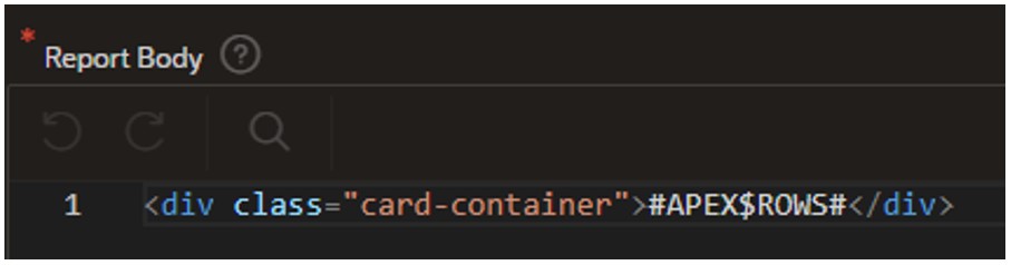
For the Report Body section, we add a container with the substitution string for the rows:
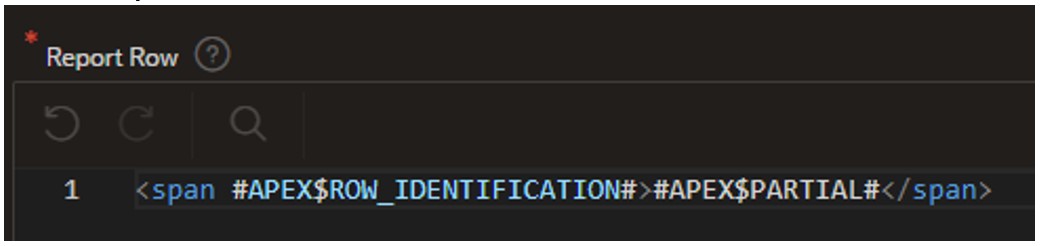
For the Report Row section:
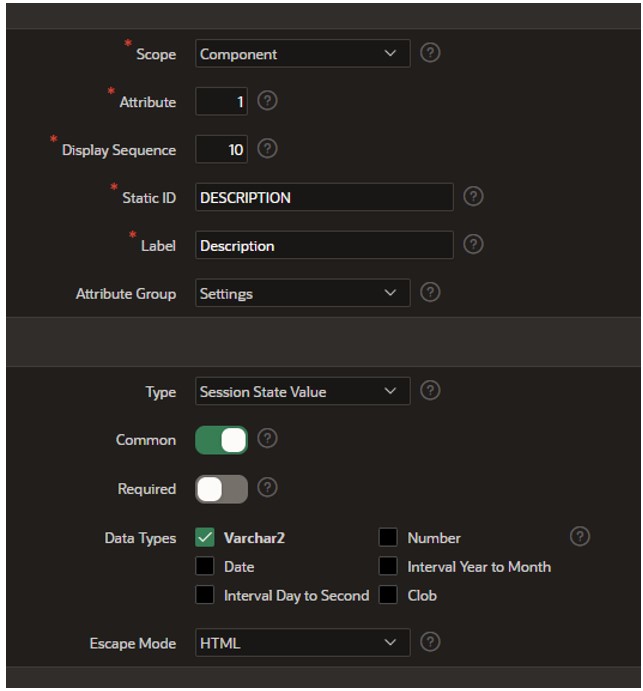
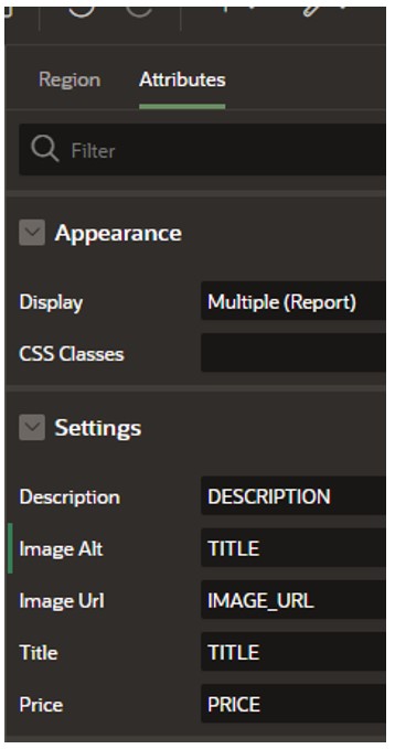
5. Now click Create Plug-in. The substitution strings we added to the HTML have been created as custom attributes with their static identifiers.
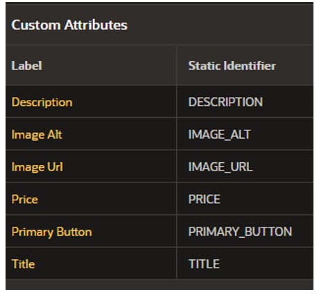
You can select these to edit the settings of each as required:
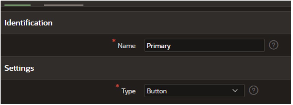
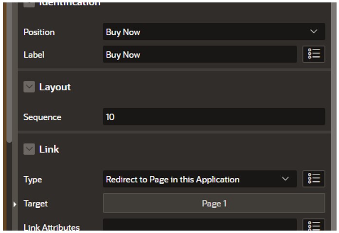
Next, we need to add the ‘Buy Now’ button for our product card.
6. Select ‘Add Action Template’. Here we will create a template for our button to use.
This will generate some template HTML for us.
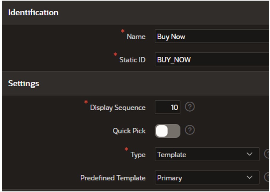
7. Now select ‘Add Action Position’ populate and click ‘Create’:
8. Now we need to add our CSS – Click ‘Create File’ in the Files section. Give your file a relevant name and hit ‘Create’.
We can now paste in the CSS and save the changes.
Add the Template Component to a page in your application
Our component is now ready to use! Let’s see it in action.
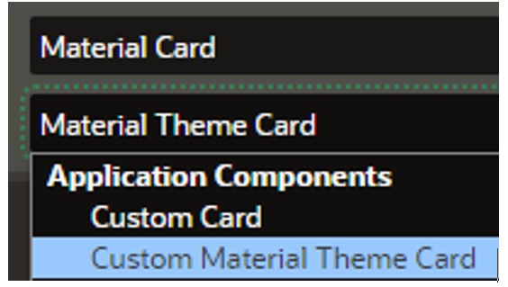
9. Create a new blank page in the application and add a new region, and you will now see the name of our newly created component under the Application Components section.
10. For the source, you can choose from the usual options. We will use an SQL query here to populate our substitution string values.
For this demo, I have just used some dummy data (example of a couple of rows below)
select 'Samsung S23' TITLE,
       '£975.00' PRICE,
       '#APP_FILES#s23.jpg' IMAGE_URL,
       'Plus Cell Phone, Factory Unlocked Android Smartphone, 256GB, 50MP Camera, Night Mode, Long Battery Life, Adaptive Display, US Version, 2023, Green' DESCRIPTION
from dual
union
select 'Z-Fold' TITLE,
       '£1075.00' PRICE,
       '#APP_FILES#fold.jpg' IMAGE_URL,
       'Foldable Cell Phone, Factory Unlocked Android Smartphone, 256GB, 50MP Camera, Night Mode, Long Battery Life, Adaptive Display, US Version, 2023, Green' DESCRIPTION
from dual
11. Next, we need to map the columns:
12. The final step is to add the ‘Buy Now’ button – right-click Actions and add:
We could have added a Custom attribute for a URL for each and populated in the query, but for the demo, I’m just linking to a page in my application.
The Result
All that’s left to do is run our page:
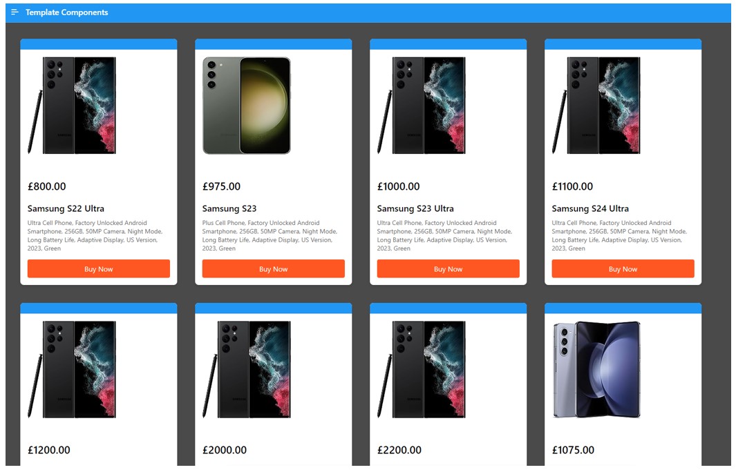
We now have a fully responsive cards region using our newly created template component!
Conclusion
In the ever-evolving landscape of Oracle APEX development, the introduction of Template Components in version 23.1 stands out as a revolutionary stride. This feature empowers developers to seamlessly design and share fully declarative UI components within APEX. The inclusion of template directives amplifies customisation possibilities, reflecting the collaborative ethos of the APEX community. With apex.world fostering a culture of sharing, developers can contribute to collective advancement. As we embrace this era of collaborative innovation, Template Components exemplify the limitless potential within Oracle APEX, inviting developers to create, share, and elevate the APEX experience collectively.
For more information, check out our APEX services, and if you liked this blog, check out our other APEX blogs here.
Remember to follow us on LinkedIn. We publish insight blogs on the latest technology developments every week.
Subscribe to Oracle APEX Insights if you want to stay tuned for more APEX updates.