- About

Getting to know us
- Industries
Recent case study:
Oracle EBS Cloud Deployment
Consolidating and Migrating assets into Oracle Cloud Infrastructure.
.png?width=250&name=stonewater-logo%20(1).png)
Most Visited Pages
-
- Resources
DSP-Explorer acquires leading Oracle Applications Managed Services Provider, Claremont, to further extend its data management capabilities.

Resources
- Contact us
Making pie charts the same size in APEX
Contents
If you have ever created a pie chart in APEX you know how easy it is to plug in a SQL statement and get a good looking chart with a host of customization options all native within APEX. Recently I created a dashboard in an APEX 4.2 application and was looking for a way to fix the width of the pie charts. I was certain there should be some option available to control this but couldn’t find it anywhere in APEX and was unable to get it working with the custom XML options.
The native AnyChart charts available in APEX are created as regions. When making a pie chart you can select from a number of different display options to control the size of your chart and whether hints, labels and a legend are shown. In my application I was trying to give each pie chart a fixed size and also include a legend. The problem here was that within the fixed size chart region, APEX was intelligently resizing the chart to accommodate the size of the legend. The number of labels on my charts is not known until they are run so this caused all my charts to appear at different sizes.
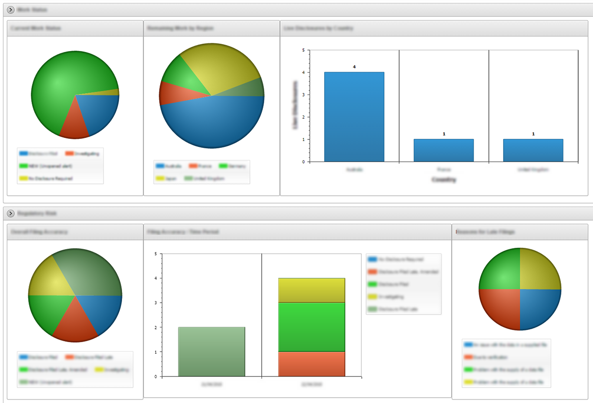
I still think there may be a more elegant way of fixing the size of the pie charts but I couldn’t figure it out in a reasonable amount of time and the AnyChart documentation doesn’t always translate directly to the APEX version of AnyChart. With that said, here is the solution I came up with.
I replaced each 400px high chart region with a container region and two identical 200px high pie charts. I then removed the legend from the top chart.
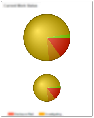
Now we can consistently set a size for the first chart across the whole page. The next thing I did was try and use the legend from the second chart as the legend for the whole region, allowing that to grow in size without affecting the first chart. I used CSS to move the second chart into the correct position.
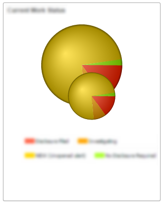
Obviously now we need to get rid of the pie chart in the second chart region. I did this by altering the z-index of each region to place the first chart region above the second.
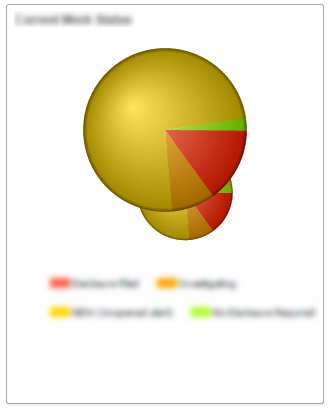
Once the second chart was behind the first I increased the “Chart Margin: Bottom” option in the chart attributes to 300. This made the second pie chart so small that it was not visible. Applying this technique to all the charts on my page gave me a more consistent looking layout.
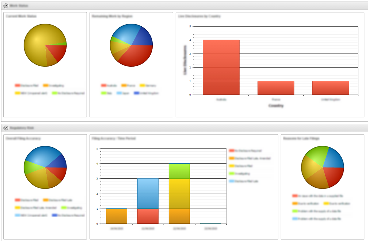
I also removed the ‘waiting for data’ message that appears when a chart is loading so that the user cannot tell that two charts are loading.
So there it is, an unconventional but really quick way of creating fixed size chart regions on an APEX page. Obviously there could be a performance hit depending on your data due to the increased rendering but it works great in this application. I would love to hear any other suggestions on how this could be achieved.
Author: Craig Sykes
Job Title: Senior Oracle Development Consultant
Bio: Craig is a Senior Development Consultant at DSP-Explorer. Craig has an MSc in Computing Science and is an experienced software engineer, utilising development tools such as PL/SQL and APEX to provide bespoke ERP software to both UK and international businesses. Craig has experience developing solutions to connect Oracle systems to a wide range of existing external applications within business environments.