- About
Getting to know us
- Services
- Managed Services
- Application Services
- Cloud Services
- Data Science
- Consulting Services
- Technology Solutions
Managed Services
Application Services
Data Science
Consulting Services
Technology Solutions
- Industries
- Resources
Resources
- Contact
- Contact us
Interactive Grid – First Impressions
Contents
I recently joined Explorer from 4 years as an APEX 4.2 Developer on a variety of projects. I looked forward to using Interactive Grid (IG) – from APEX 5.1 onwards – and it is good to see APEX progressing and developing new features such as this.
It looked a fast and easy way of streamlining the most common aspects of almost every system – the CRUD (Create, Update, Delete) of various aspects of key data – Customers, Suppliers, Stock details etc. as in prior versions of APEX these would usually take the form of a creating an Interactive Report (IR), with various links and buttons to other Pages to handle the create / edit and deletion of the data and its validation – and although these were not complicated tasks, they took up Developer time and effort and very repetitive in nature, so to have one APEX component that would handle all of this was ideal.
From a Developers point of view, it was impressive as to how easy it was to create the Interactive Grid and, “out of the box”, it covered all the requirements stated above with relative ease and reduced development time and effort. It’s fast, responsive and looks modern and clean and has some nice features, like Multiple row processing, Freeze columns and many existing features taken from Interactive Reports.
However, from the Users point of view, one of the most important aspects of any Application is keeping the same look and feel, and this is where Interactive Grid starts to separate from the APEX “norm” …

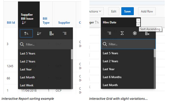
For example, Column sorting (see above), Column Selection and the Search drop down and although these might seem little differences they all require different training and documentation and having things that are “similar but different” can always be a source of frustration. Hopefully, these will be addressed in future releases as the aim seems to bring IR and IG together (hardlikesoftware blog).
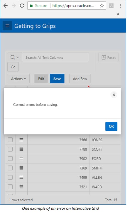
Unlike Form-based data entry, Row-based was always going to produce challenges in validation messages and the IG can seem a little confusing as they display as little red triangles, large Page based error messages or red X’s on the field – which can sometimes be difficult to understand (and find) on smaller mobile sized screens.

These are all minor points, and there is no doubt that “out of the box” Interactive Grid works well to cover the simple CRUD tasks easily as well as giving us extra welcome features, especially the ability to have Master-Detail Interactive Grids on one APEX Page.
For the more advanced areas of Interactive Grid, Senior Oracle APEX Development Consultant Matt Mulvaney here at Explorer UK has done a lot of work and research into the more advanced areas of the Interactive Grid – (Explorer UK Interactive Grid) dealing with the extra options and processing that can be available using the JavaScript API.

.png?width=250&name=stonewater-logo%20(1).png)
