- About

Getting to know us
- Industries
Recent case study:
Oracle EBS Cloud Deployment
Consolidating and Migrating assets into Oracle Cloud Infrastructure.
.png?width=250&name=stonewater-logo%20(1).png)
Most Visited Pages
-
- Resources
DSP-Explorer acquires leading Oracle Applications Managed Services Provider, Claremont, to further extend its data management capabilities.

Resources
- Contact us
Mobile-Compatible vs Mobile-Centric APEX Apps
Contents
Oracle APEX is an excellent low-code platform that can display content on a variety of device types and screen sizes, including desktop, tablet, and mobile. While anyone should be able to quickly put together an APEX app using native features that are usable across all these devices, it is not always the correct approach to rely on this in place of targeted application design. Organisations increasingly require business-critical applications to work seamlessly on both mobile and desktop. There is an important distinction to be made between applications that are mobile-compatible and those that are mobile-centric. When designing applications, the most important question to ask from a UI perspective is how the app will be physically used – does it need to be predominantly desktop-based or mobile-based?
This blog explores the differences between a mobile-compatible and a mobile-centric approach to APEX design, examining some of the native features that support both approaches.
Mobile-Compatible Apps
A mobile-compatible application is one that is designed to be predominantly used on the desktop, but with certain responsive features that allow it to function on a smaller screen.
Common features are:
-
Desktop first page design
-
Use of reflow features on Interactive Report (IR)/Interactive Grid (IG)
-
Menus and Buttons that reposition but do not simplify content
-
Intelligent use of hover-over info
There are several advantages to using this approach. First is simply the design/development/maintenance overhead: you only need to build one application to be used across devices. Reporting features, such as Interactive Report, which are commonly used in APEX, are more desktop-friendly out of the box.
The disadvantages of this approach centre around the limitations of small screens: data entry can be fiddly, there is a constant need to scroll, and the controls are less touch-friendly than in a dedicated mobile app.
So the question at the design stage must be: does my application, or elements in my application, require either a) designing as mobile first or b) having a mobile first alternative to the desktop version? If the functionality in the app cannot be fully realised by using responsive features, then producing mobile-centric pages for certain tasks is a serious consideration. The flip side to that coin is that mobile-first design doesn’t always make the best use of space on a desktop, so balance is key.
Examples of responsive features in APEX
One important change in APEX that came in 24.2 is that a few ‘responsive’ reports were deprecated. The Reflow report allowed you to set up a classic style report that would automatically go into stacked mode on a smaller screen.
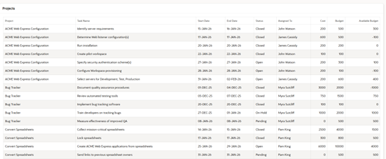
Fig 1: Legacy reflow desktop mode
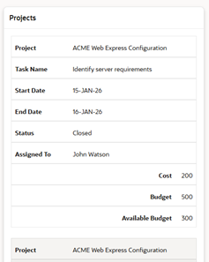
Fig 2: Legacy reflow mobile mode
Similarly, the Column Toggle report allows you to select which column should be hidden automatically on a smaller screen. Oracle has now deprecated these report types, presumably due to the philosophy that they provided a ‘halfway house’ and that truly mobile-centric design should be prioritised instead, where needed. While these reports are still available under the legacy option, they are not recommended for new development (as they are unsupported and may be made unavailable in later versions).
The Classic and Interactive Reports are reasonably responsive by default, in that they will both resize to show all available columns, switching to horizontal scroll enablement if all columns simply won’t fit. Therefore, if a page needs to be mobile-compatible, you must consider how many columns are needed on the report and how convenient it would be for a user to scroll to the right to see all the necessary information.
Another feature of the IR that helps alleviate the ‘too many columns’ problem is Detail View. This allows you to set up an HTML template to display the data in detail view, much like the stacked view the reflow report provided.
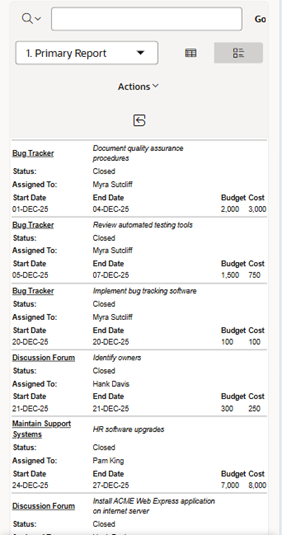 Fig 3: IR detail view
It should be noted that this is an option the user would have to toggle on a mobile to view.
In terms of data entry, APEX is smart when it comes to page item positioning, moving items around based on screen size. The key consideration is how much vertical scrolling a user will need to do. It’s important to ensure the placement of elements such as buttons on the page grid is considered, as the reorganisation of elements on mobile can disrupt the display. For example, by placing buttons between items instead of at the top of the page. To prevent this, ensure an appropriate placeholder is specified by fixing the position by column or row.
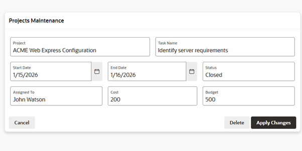
Fig 4: Form on desktop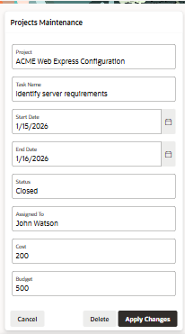 Fig 5: Form on mobile
An interesting consideration in terms of button positioning on mobile displayed forms that don’t fit vertically is whether you put the button at the bottom of the screen (so the user has to scroll down) or whether you make it ‘sticky’ (so it’s always visible). Depending on the workflow, you may want the user to be able to submit the page immediately, or you may want to force them to view every item before hitting submit.
This responsiveness applies to a host of native features (e.g. search regions, faceted searches), which will all flip to vertical mode on mobile.
So, in summary, you can build mobile-compatible apps, with some careful design consideration, pretty much out of the box. However, utilising mobile-centric features will truly enhance the usability of an app on mobile.
Mobile-Centric Apps
A mobile-centric, or mobile-first, application is one where the size and usage patterns of a mobile screen are the primary consideration.
Common features are:
-
Task-focused screens, with minimal actions per page
-
Lack of data overload, i.e. minimal amounts of data on a page, no reports with a lot of columns
-
Touch-screen friendly buttons and menus.
The advantage of a mobile-centric app is that it tends to be more intuitive to use, due to task simplification. The disadvantages are that mobile-first elements may require a different UI from the desktop (resulting in more screens and potentially duplicated functionality), and more careful planning is needed around the scope of the mobile screen.
A mobile-centric app may be used in conjunction with a desktop application. For example, there may be a need for a report that shows a lot of detail across multiple columns; however, it is likely that the use case for accessing that report is solely on the desktop. Conversely, functional data entry work may be more suited to a mobile device. For example, a surveyor walking around a building site with a mobile phone, recording snags and uploading pictures to a database. Back in the office, they may wish to review a report of all snags recorded that day and their current statuses.
The main thing to keep in mind when considering mobile vs desktop design is that the goals often differ. Mobile usage is typically less about displaying as much information as possible at once and more about managing single tasks.
On mobile, regions such as cards and lists can be used instead of Classic/Interactive reports to show a smaller set of essential information, possibly with the ability to drill down to specific records for more information or actions. You can also easily create custom region templates (under plugins in shared components) to create a fully custom view of your data if cards aren’t flexible enough.
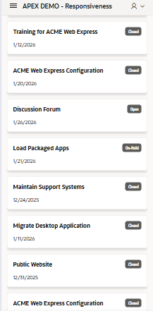 Fig 6: Simple Cards menu on mobile
Another key area to consider is data entry forms. While APEX can intelligently stack page items on a smaller screen, this can create the need to vertically scroll, which may be sub-optimal from a UI perspective. A mobile-centric design would instead break large forms into wizard-style stages, with a single function per page, so that minimal scrolling is required and data can be entered one stage at a time. This can be combined with large, clear buttons that simplify the controls.
With regards to menus, APEX is smart in its use of space, but the nature of side and top menus (which allow for submenus) means they are still not always optimal for mobile use. Instead, a cards menu is recommended – in a multi-format app, this could be in addition to the standard menu for ultimate flexibility.
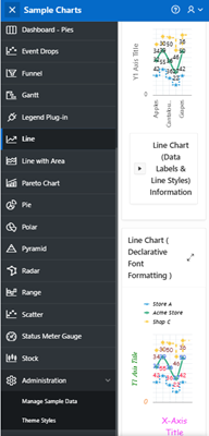 Fig 7: APEX Sample Charts App Side Menu on mobile
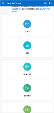 Fig 8: Equivalent Cards Menu
It is quite common for home pages to house a dashboard of some sort. However, on a mobile, it is sensible to replace this with a card-based action menu. Dashboards themselves are another area that fulfils different needs on mobile vs desktop. On a desktop, a dashboard page may be filled with multiple graphs, with drilldowns and hover-overs, etc. On mobile, the best approach is simple, clear high-level information (numbers, status, etc.), using colour to illustrate. Rather than filling the page with as much detail as possible, on mobile, consider one chart/info stat per page.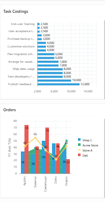 Fig 9: Dashboard Mobile Display – The APEX sample charts app dashboard scales well on a mobile, but charts are still quite cluttered
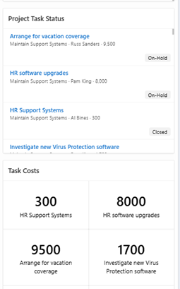 Fig 10: Cards and list elements provide much clearer information
Conclusion
Oracle APEX provides excellent native responsive functionality. However, if you truly need an application to suit both mobile and desktop usage, it’s worth dedicating time to designing both desktop-friendly and mobile-dedicated functionality. This may involve creating additional apps or pages (which still share the underlying data model, security, etc), rather than trying to find the middle ground.
For more information, check out our Oracle APEX Services, and if you liked this blog, check out our other APEX blogs here.
Contact us today, and one of our expert developers will be in touch.