- About
Getting to know us
- Services
- Managed Services
- Application Services
- Cloud Services
- Data Science
- Consulting Services
- Technology Solutions
Managed Services
Application Services
Data Science
Consulting Services
Technology Solutions
- Industries
- Resources
Resources
- Contact
- Contact us
Adding a Mobile Ellipsis button
Contents
Following a day of hard work building APEX applications, I jumped on the train home and started catching up with the latest news & sport.
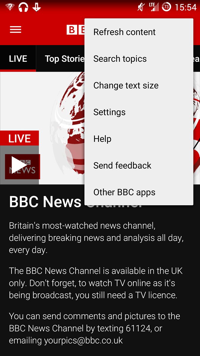
I loaded up the BBC News App, I noticed a button I regularly used but never really took notice of it.
It’s the Ellipsis button and it features in many other mobile applications.
The Ellipsis button is used to represent additional options, settings or preferences and it’s often placed on the top right of the interface. The icon is sometimes featured as an Ellipsis, cog or three horizontal bars.
Back in the office the next day, I tried to recreate this in a Mobile Application. It should be quite easy as all I would need to do was change the Navigation Bar Entries, change the icon and all would be good. Well…. that’s how it’s done in the Universal Theme with a little jQuery magic.
Before I started, I found the Mobile Theme (51) was set as “Classic” for its Navigation Bar Implementation and therefore I needed to amend the Classic Navigation Bar entries instead of the List based equivalent.
Whilst editing the Classic Navigation Bar I noticed that none of my changes were taking affect. Amazingly, could even remove the “Log Out” entry yet the Log Out button still remained on screen.
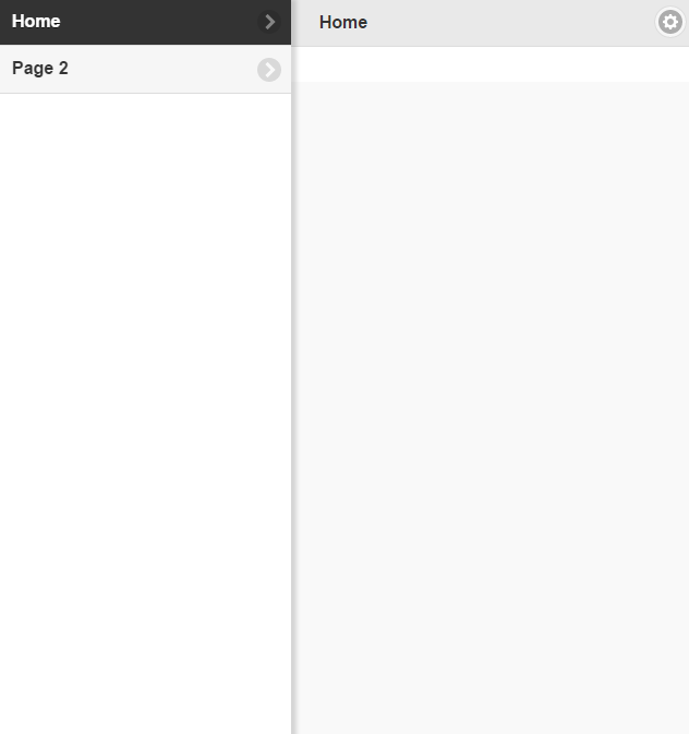
You may have noticed that a Page Zero/Global Page is always created for a mobile application. This page contains an icon button for the menu which, when clicked (or tapped), calls a JavaScript Dynamic Action to activate the jQuery left hand side Navigation Panel. This panel is sourced from the Mobile Navigation Menu list which is easily editable through Shared Components.
The panel is nicely animated from the side and collapses again when the user swipes it back to the side of the screen. The panel is a familiar navigation item for mobile users.
The Global Page also holds a text button for the Log Out button. This is simply a button which, when tapped, opens up the Log Out URL. Therefore the Navigation Bar is not sourced from the Classic Navigation Bar entries but instead is set by editing buttons on the Global Page.
The Universal Theme performs an excellent job of displaying menu entries in the Navigation Bar however for mobile applications we would have to do something different. I liked the look of the left-hand side panel when the Home button is tapped and I wondered if I could adapt it for an Ellipsis Button.
The first thing I did was to rename the Logout Button to “Option” and change the associated True action to call a similar JavaScript which the Menu button uses – the only change being to change the ID to “barpanel”.
I then took a copy of the “Pages” Templates, applied the new template to Page 1 and started to edit the template.
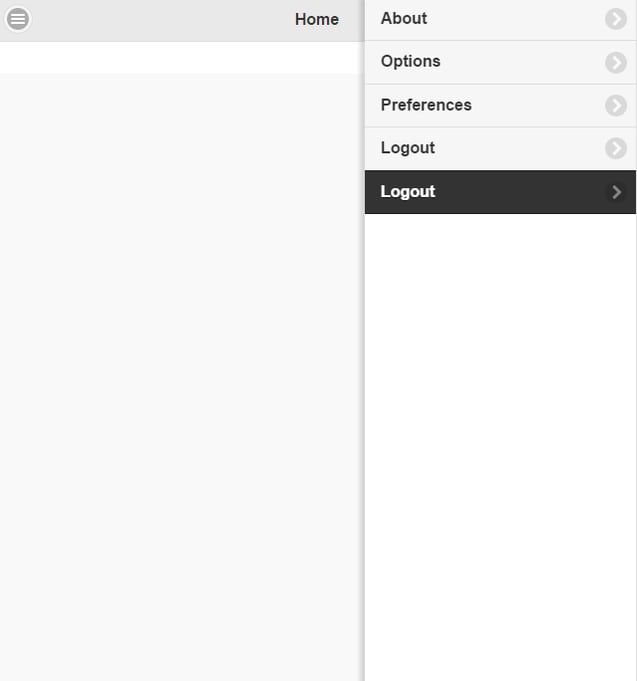
I found the panel entry, duplicated it and changed the id to barpanel and the data-position so that the menu would appear from the right hand side of the screen.
However I needed to change the navigation list this panel was based upon and looked around for possible substitution stings, experimenting unsuccessfully with #TOP_GLOBAL_NAVIGATION_LIST# , which returned no results, and then with #NAVIGATION_BAR#. The latter did provide my Classic Navigation Bar entries by not in the HTML format which this panel required and so the formatting was off.
The final option I tried was to use a new Application Item called &APP_BAR. which I substituted in place of #SIDE_GLOBAL_NAVIGATION_LIST# . This Application Item contained the correct HTML which was set from an Application Process.
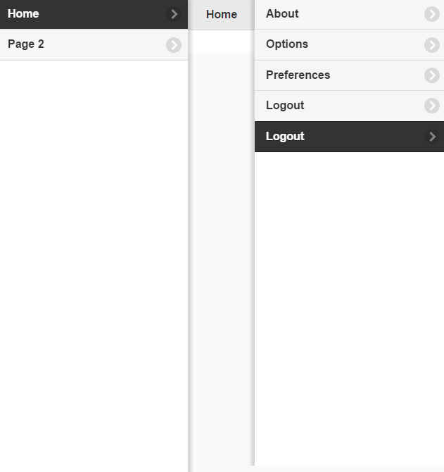
The Result is really quite nice and complements the Menu Option:
|
|
||||
|
|

.png?width=250&name=stonewater-logo%20(1).png)


